| Data Types |
| Prev | Working With Data | Next |
Plots in Kst are created by building up objects into the displayed curves. In Kst, there are 5 major classes:
Data Sources: data files which are recognized by Kst.
Primitives: These are basic data types, including Strings, Scalars (which are single numbers), Vectors (which are ordered lists of numbers) and Matrices (which are 2D arrays of numbers).
Relations: these objects describe how vectors or matrices are displayed in a plot. They include Curves (which display an XY pair of vectors) and Images (which display matrices).
Data Objects: these classes take Primitives as inputs, process them, and output Primitives. These include Spectra, Histograms, Equations, Fits, Filters, and other Plugins.
View Items: these are objects that can be drawn, and include plots, labels, lines, etc. Plots can display Relations (curves and images). Labels can display Scalars and Strings.
As an example of how these various classes work together, consider the example session in the chapter on Filters. In this session, a curve from a data file was plotted, along with a low pass filtered version of the curve. The resulting data structures are as follows:
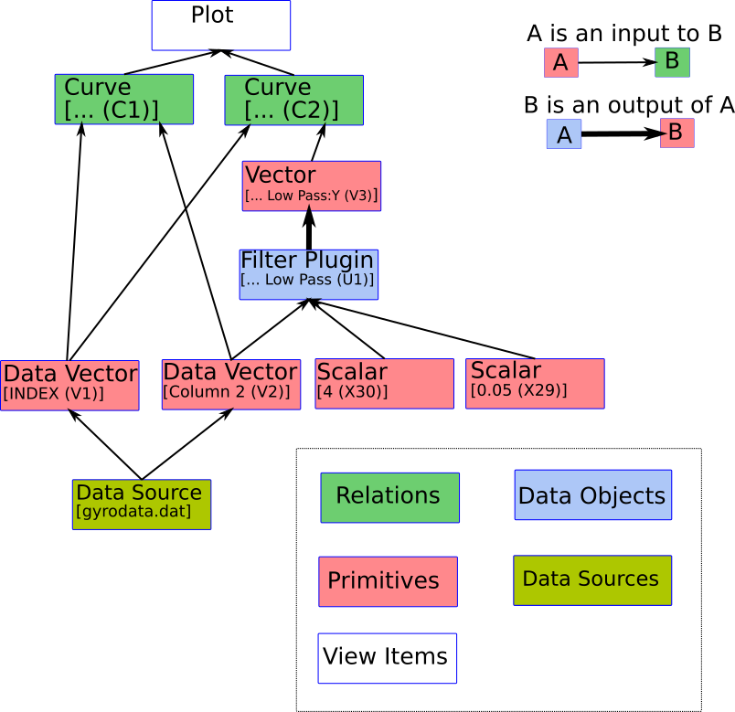
The plot displays two curves. One curve takes two data vectors (INDEX and Column 2) as inputs. The other takes INDEX as its X vector, and the output vector of the Low Pass Filter as its Y vector. The low pass filter takes the Column 2 vector, and two Scalars as its inputs. The two data vectors get their data from the Data Source.
The data manager for this sessions is shown below. Note that the literal scalars [4 (X30)] and [0.05 (X29)] are not listed. To keep things clean, and because '4' is not editable, literal scalars like this are not presented in the UI.

This structure could have been chained together further. For example, the output of the Filter could have been used as the input to a Histogram, and the Histogram of the output of the filtered data could have been plotted instead.
Descriptions of each data type are provided below.
Vectors are ordered lists of numbers. They are used as the inputs to Data Objects. They are also used to define the X or Y axis for curves. While different types of vectors are created in different ways, they can all be used in Data Objects or curves in the same way.
Data Vectors acquire their data from Data Sources (ie, data files). They can be created from the option in the menu, or by selecting the
![]() icon in any vector selector.
icon in any vector selector.
Generated Vectors are lists of equally spaced numbers whose range and spacing is defined in the GUI. They can be created from the option in the menu, or by selecting the
![]() icon in any vector selector.
icon in any vector selector.
Editable Vectors have their data defined through the Python interface. They can not be created or edited in the GUI.
Output Vectors are the output of data objects, such as histograms or filters.
Scalars are single numbers that can be used in labels and equations.
Generated Scalars are a single number whose value is defined by the user. To create a Generated Scalar, select Generate in the New Scalar dialog, opened by selecting from the menu.
Data Vector Field based Scalars are generated through Data Sources from the a single specified from a vector field on disk. To create a Data Vector Field based Scalar, select Read from data vector from the New Scalar dialog under in the menu. You will specify the data file to read from, the Field name for the vector, and the index of the field you want to read from. In real time applications, one might want to only read the most recent value. In this case, select last frame rather than entering a frame number.
Data Scalars are scalars output directly by data sources. Most datasources provide FRAMES which gives the number of frames in the data file. Some data sources (eg, dirfiles) also support user defined scalar values. These are read by selecting Read from data source from the New Scalar dialog under in the menu.
Slave scalars are created automatically by each vector which has been created in Kst. Many of these are particularly useful in text labels. The automatically created slave scalars are:
| Scalar Name | Description |
|---|---|
| NS | The number of data points in the vector. |
| First | The first data point in the vector. |
| Last | The last data point in the vector. |
| Min | The minimum value in the vector. |
| iMin | the index in the vector of the minimum value in the vector. The first sample in the vector is index 0. |
| Max | The maximum value in the vector. |
| iMax | the index in the vector of the maximum value in the vector. The first sample in the vector is index 0. |
| Mean | The mean of the data points in the vector. |
| Sigma | The standard deviation of the data points in the vector. |
| Sum | The sum of the data points in the vector. |
| SumSquared | The sum of the squares of the data points in the vector. |
| Rms | The square root of the mean of the squares of the data points in the vector. |
| MinPos | The smallest positive number in the vector. |
The names for Slave Scalars are <Vector Name>:<Scalar Name> (X<N>). For example, the name of the scalar giving the last sample of the Vector Az (V2) would be Az:Last (X18).
Curves are used to create plottable objects from vectors. Curves are created from two vectors - an “X axis vector” and a “Y axis vector”. These two vectors are interpreted as a set of (X,Y) pairs to be plotted. When the X and Y vectors have the same length, the interpretation is obvious.
If, however, the X vector is of a different length than the Y vector, then the first and last points of each are assumed to represent the first and last (X,Y) pair, and the shorter vector is resampled using linear interpolation to have the same number of samples as the longer vector.
Curves are created by the data wizard, from the creation dialog from Data Objects (such as histograms) or by using the option in the menu. The latter produces the following:
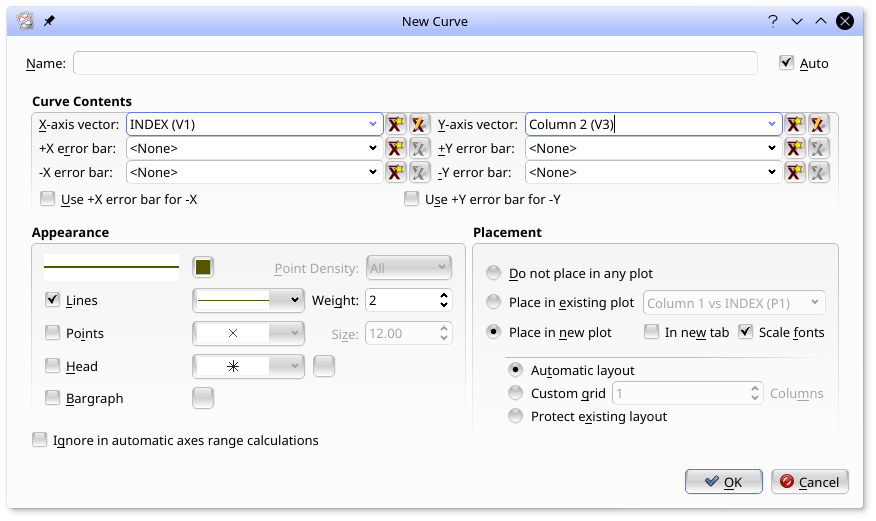
Here, in the Curve Contents box, the curve has been set up to use INDEX (V1) as the X axis vector and Column 2 (V3) as the Y axis vector. Note that vectors holding X and Y axis error bars can also be selected. The
![]() icon in any of the vector selectors will bring up a new vector dialog. The
icon in any of the vector selectors will bring up a new vector dialog. The
![]() icon will edit the selected vector.
icon will edit the selected vector.
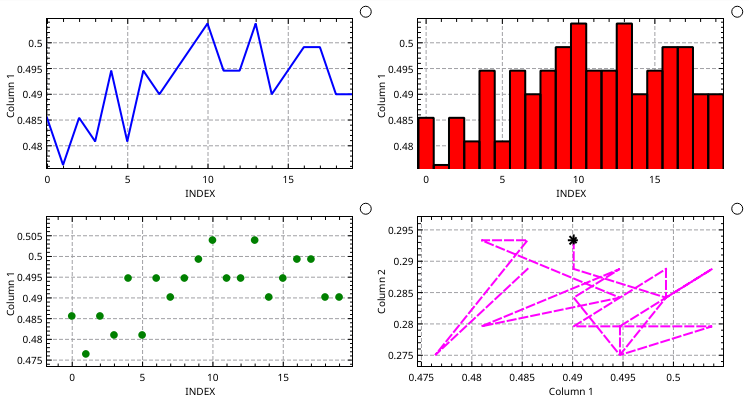
The appearance of curves is adjusted in the Appearance box. Some of the flexibility of curves in kst is shown in the next figure. Note that the options are not exclusive - for example, Lines and Points can both be selected. The Size field specifies the dimensions of display elements such as points and error flags in points (the same way as font sizes are defined.) The Weight field specifies the width of lines, bar graph borders, and the strokes for points. The color selector to the right of the example line sets the color of lines, points, and bargraph borders. The color selector to the right of the Bargraph checkbox sets the fill color for bargraphs. The last (most recent) point of a curve can be indicated by selecting Head and specifying a point type and color. The color selector to the right of the Head sets the color for this point.
The Placement box specifies what plot the curve will be displayed in. Both the Placement and Appearance boxes appear in data object creation dialogs as well, and work the same way.
Equations are data objects whose outputs are:
A vector (...:y) which is the function of one or more data vectors.
A vector (...:x) which passes through the X input vector.
The inputs are:
A vector which is used as the x variable in equations.
Any vectors or scalars specified by name in the equation text.
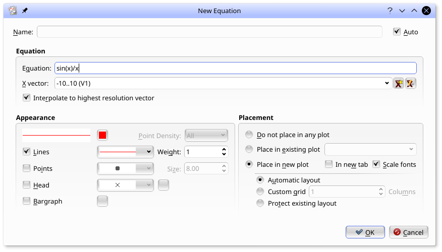
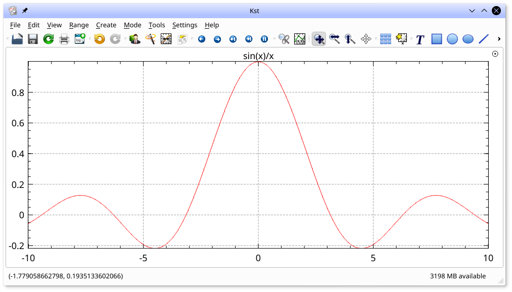
Equations are used to produce vectors which are the point-by-point function of one or more input vectors and scalars. They are created by selecting from the menu. An example of creating an equation, and the resulting plot is shown below. In this example, a Generated Vector consisting of 1000 points from -10 to 10 was selected for the x vector. Recall that a Generated vector can be created by selecting the new vector icon,
![]() which appears to the right of the X Vector field. The equation,
which appears to the right of the X Vector field. The equation, sin(x)/x, was entered into the Equation field.
Equations support the following operators:
Arithmetic operators: +, -, *, /, % (modulus operator) and ^ (power operator).
Bitwise operators: &, |. These operators assume the vector is comprised of integers.
Logical operators: !, &&, ||, <, <=, ==, >=, >, and !=. These functions output 1 for True and 0 for False.
Functions supported by kst are:
Trig functions working in Radians: SIN(), COS(), TAN(), ASIN(), ACOS(), ATAN(), ATAN2(), SEC(), CSC() and COT().
Trig functions working in Degrees: SIND(), COSD(), TAND(), ASIND(), ACOSD(), ATAND(), SECD(), CSCD() and COTD().
Other functions: ABS() (absolute value), SQRT() (square root), CBRT() (cube root), SINH(), COSH(), TANH(), EXP(), LN() (natural logarithm), LOG() (base 10 logarithm) and STEP() (returns 1 if the argument is greater than 0, and 0 otherwise).
Equations also support the constants PI and e.
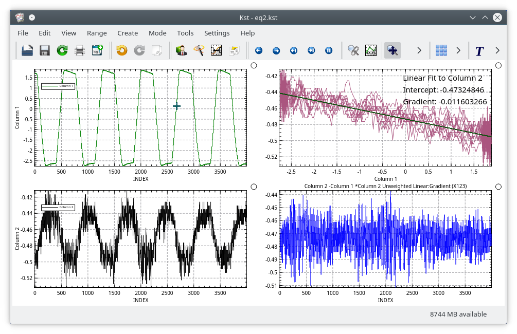
Equations can use any vector or scalar as their input vectors, not just the X vector. In the next example, the bottom right plot shows the signal in Column 2 with the signal in Column 1 regressed out of it. This has been done by subtracting Column 1, scaled by the slope of a fit to Column 2 vs Column 1, from Column 2. The fit had been created previously using the option in the right mouse button menu of the top right plot.
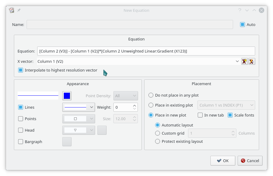
The New Equation dialog which created this plot is shown below. Note that vectors are identified by enclosing their names in [ ]. So Column 2 is indicated by [Column 2 (V2)]. The Equation line widget has a fairly powerful autocomplete mechanism with a scrollable list of all possible scalars (in its first column) or vectors (in its second column) as you enter the name of the object. Similarly, the auto complete lists all valid functions and operators as relevant while you type. The Esc key hides the autocomplete widget.
If the vectors were set to Read to end mode, all elements would be updated real time as new data came in.
Histograms are data objects whose outputs are:
A vector (...:num) which contains the (optionally normalized) count of samples from the input vector which lie within each interval.
A vector (...:bin) which contains the center of each interval for which the counts have been calculated.
The input is:
A vector for which the histogram is calculated.
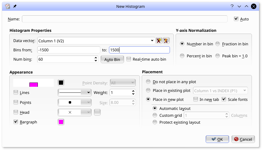
In the New Histogram dialog, the bins can be set manually, can be preset once by selecting Auto Bin or can be set to be automatically reset with each data update by selecting Real-time auto bin.
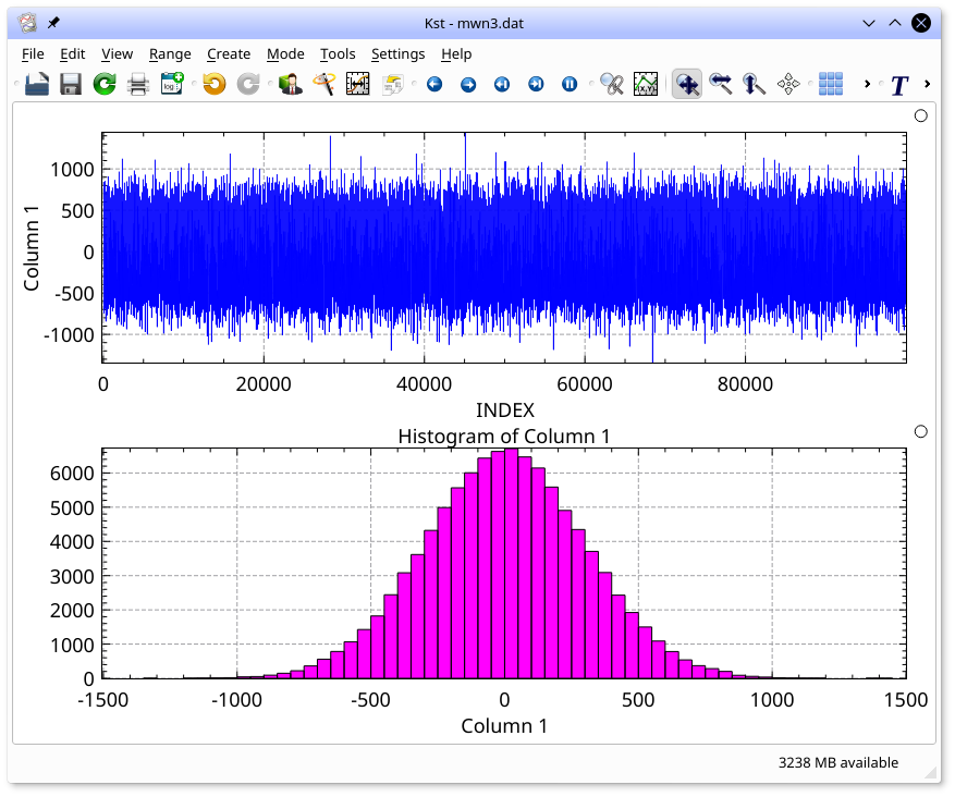
By selecting Bargraph in the dialog, the histogram can be shown in the standard bar-graph form, below.
Power Spectra are data objects whose outputs are:
A vector (...:psd) which contains the fft-based spectrum of the input
vector.
A vector (...:f) which contains the centers of the corresponding
frequency bins.
The input is:
A vector for which the power spectrum is calculated. Uniform sampling is assumed.
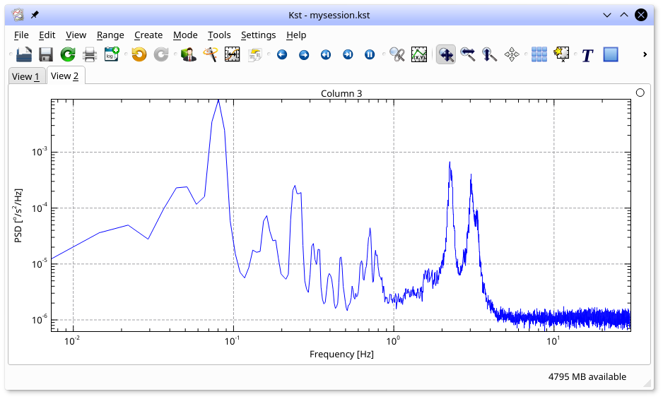
The following plot shows an example spectrum. The plot has been converted to log-log mode (hit 'l' and 'g' in the plot window to toggle Y and X log axes respectively).
The spectrum dialog (select from the menu) used to create this plot is shown below:
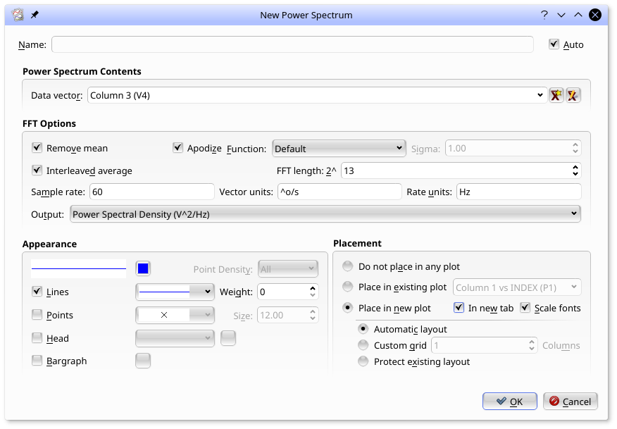
The dialog entries are as follows:
The data vector to create a power spectrum from.
Remove a constant from the input vector to make it mean zero before calculating the spectrum.
Apodize the data with the selected function before calculating the power spectrum to reduce bin to bin leakage. The default is a Hanning Window.
When Interleaved average is not set, the spectrum is based on an FFT whose length is power of two larger or equal to the length of the input vector. The remaining points are zero padded. For cases like this, apodization and mean removal is quite important.
When Interleaved average is set, the spectrum is based on the average of FFTs of length 2^x where x is specified by the FFT Length entry, interleaved such that no zero padding is required. Choosing this option reduces the noise of the spectrum, at the cost of reduced resolution.
The frequency bin output vector (...:f) will be calculated assuming the input vector was uniformly sampled at this sample rate.
Auto-generating axes labels for plots will be based on these units.
Fits are data objects whose outputs are:
A vector (...:Fit) which is the fit to the data, evaluated at the X value corresponding to each input Y point.
A vector (...:Residuals) which is the difference between the input Y vector and the fit.
One or more named scalars which correspond to the fit parameters. For example, for linear fits, the scalars are ...:Intercept and ...:Gradient.
A scalar (...:chi^2/nu which holds the reduced chi squared of the fit.
A vector (...:Covariance) which holds the Covariance matrix of the fit in an arbitrary order. Because the parameters are listed in an arbitrary order, this vector is not currently particularly useful.
A vector (...:Parameters) which is a list of the fit parameters in some arbitrary order. This vector is rarely useful and may be removed in the future. The named parameter scalars are a much more useful interface to the fit parameters.
The inputs are:
A vector which is to be fit to. (The Y axis vector)
A vector which is used to generate the X values corresponding to the Y vector. Note that if the X vector is not the same length as the Y vector, then the X vector will be resampled to have the same number of points as the Y vector in order to generate a series of (X, Y) pairs.
If a weighted fit is chosen: A vector which describes the error bars for the Y vector.
A number of fits are available in kst, including weighted (in which the error bar for each Y value is specified) and unweighted fits to lines, polynomials, Gaussians, Lorentians, and exponentials.
The easiest way to create a fit is by selecting from the plot context menu (right click in the plot, and then selecting the curve you would like to fit. The following dialog will appear.
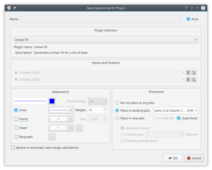
A linear fit has been selected in the Plugin Selection combo box. The X and Y vectors have been automatically selected from the curve which was selected and can not be changed. The curve properties and placement of the automatically generated curve can be selected as usual.
When has been selected, the curve is placed in the selected plot, and a label with the fit parameters is automatically created. Click the mouse wherever you want the label to go.
You can also create a fit plugin by selecting the appropriate fit from the submenu in the menu. With this dialog you can select the input vectors, but it does not automatically create a curve. You will have to create a curve by hand by selecting in the menu.
Filters are data objects whose output is:
A vector (...:Filtered) which is the same size as the input vector.
The inputs are:
A vector which is to be filtered.
A number of numbers or scalars which are parameters for the filter.
A number of filters are available in kst. The band pass, band stop, high pass and low pass filters are conventional zero phase shift Fourier domain filters whose band edges follow the shape of a Butterworth filter. A higher order filter is a steeper cutoff.
Numerical Integrals can be created with the Cumulative Sum filter, and Numerical Derivatives with the Fixed Step Differentiation filter. In both of these dX takes the size of the step between samples.
For fields such as angles which have (for example) a discontinuity at 360 degrees, the Unwind Filter can be used to make the signal continuous. So if the unfiltered signal goes from 359.5 degrees to 0.5 degrees in consecutive samples, the filtered signal will go from 359.5 degrees to 360.5 degrees.
The Flag filter can be used to mask a vector with NaNs whenever certain bit patters in the flag field are true.
The easiest way to create a filter is by selecting from the plot context menu (right click in the plot, and then selecting the curve you would like to fit.
You can also create a filter plugin by selecting the appropriate filter from the submenu in the menu. With this dialog you can select the input vectors, but it does not automatically create a curve. You will have to create a curve by hand by selecting in the menu.
Plugins that do not fit the requirements of being either fits are filters can be created from the submenu in the menu. They are not well documented.
Matrices are two dimensional tables of numbers. They can be used as the inputs to Data Objects. They are also used to define the values for Images. While different types of Matrices are created in different ways, they can all be used in Data Objects or Images in the same way.
Data Matrices acquire their data from Data Sources (ie, data files). They can be created from the option in the menu, or by selecting the
![]() icon in any matrix selector (for example, in the Image dialog).
icon in any matrix selector (for example, in the Image dialog).
Editable Matrices have their data defined through the Python interface. They can not be created or edited in the GUI.
Output Matrices are the output of data objects, such as Spectrograms.
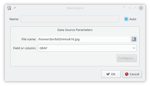
Matrices can be read from:
Any data file compatible with QImage - (jpg, png, tiff, bmp, gif, etc). For color images, four matrices can be read: RED, GREEN, BLUE, and GRAY.
conventional 2D FITS images (if built with cfitsio).
BIT Image Streams (BIS) files.
The BIS data source can provide matrices from an image stream. In these cases, the frame number can be selected when the Matrix is created.
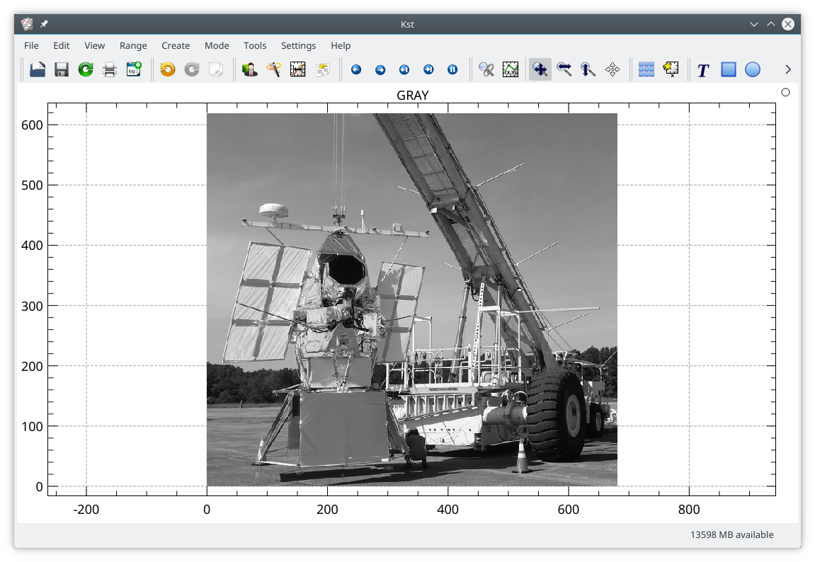
Images are used to create plottable objects from Matrices. The pixels are directly mapped from the matrix. ie, rows in the matrix are rows in the image. Columns in the matrix are columns in the image. The value of the Matrix sets the color of the pixel.
Images are typically created from selecting from the menu. The Image dialog is shown below:
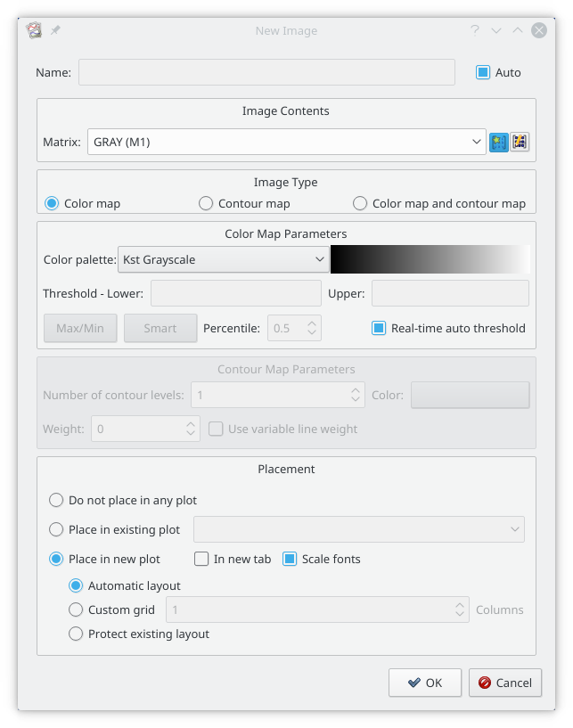
A matrix has been read from a png file, and selected in the Matrix selector (GRAY (M1)). A color map rather than a contour map has been selected, and a grey scale color pallet has been selected. With Real-time auto threshold selected, the maximum value in the matrix will be set to the maximum value of the color pallet, and the minimum value in the matrix will be set to the minimum value of the color pallet. All other values will be linearly interpolated. Alternatively, the maximum and minimum values can be set once, either using Smart/Percentile tool, or by manually setting the thresholds.
The resulting image is shown below. Note that, by default, the image will automatically fill the plot window, and will not preserve aspect ratio.
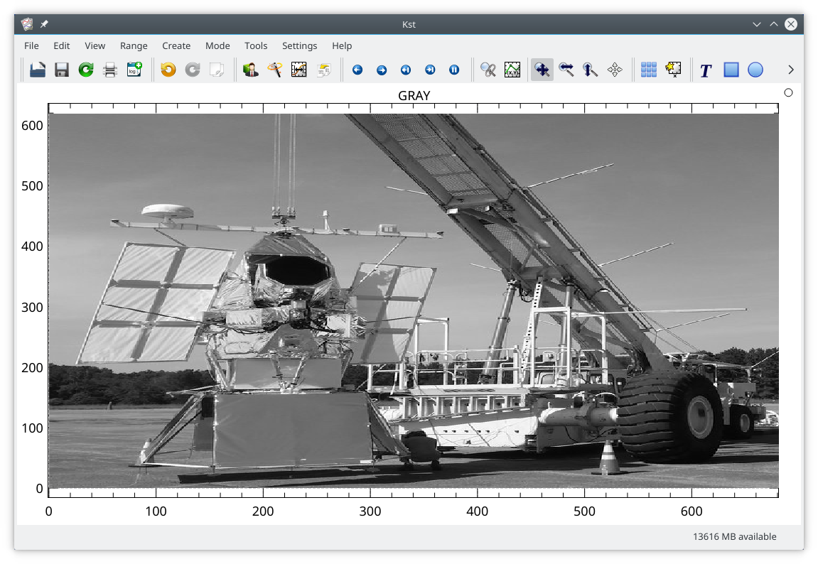
The aspect ratio can be normalized by selecting in the submenu of the plot context menu, or by pressing the "n" key in a plot window. The image will now have square pixels.
The range of the color pallet can be adjusted from the curve edit dialog, or by pressing 'i' in an image. This will cycle the color limits, allowing an increasing fraction of the pixels to be saturated at either end of the color scale before returning to full range.
| Prev | Contents | Next |
| The Data Manager | Up | Saving and Printing |